Conversion optimization is more challenging for firms with a non-structured approach to business and growth. Companies that adopt a more structured strategy have double the chances of succeeding as compared to other organizations that have a typical traditional approach to business and development. A properly working website is an important element in today’s ever-changing e-commerce world, since it may either help or hurt a company.
It’s difficult to get a leg up in the e-commerce market these days, with so many competitors. You’re not only competing with your local regional companies, but you have to compete with international behemoths like Amazon and Walmart, making it all the more difficult to differentiate yourself and do good without going above and beyond.
So what are those special set of qualities that can set you apart from the rest?
Core Qualities
1. Make Their USP Clear
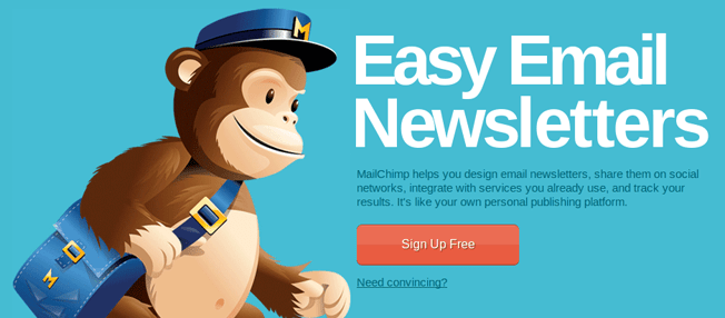
Your Unique Selling Points or your Unique Value Propositions. As soon as prospective customers visit your website, they should get a loud and clear idea of what you do. What does your business specialize in? To begin with, create a Logo that resonates with your idea of the whole business. A logo is the first and foremost placement of your website that people will notice, the size, the color, the design everything should be just perfect. Your logo doesn’t just connect you to your audience but is an identity to your overall brand. The next thing I can think of is your Tagline; Your tagline should be catchy and understandable enough for your customers to relate to your brand quickly, it should not be something that is confusing. Your tagline just like your logo should be able to define your business’s vision and mission. A great example of this would be Mailchimp.
2. Online PR & Efficiencies of Scale
The one thing that top-performing websites are now doing differently is to focus on an extra budget back up towards the top of the funnel (TOFU). The best way to kill the competition when people search for you is to have the audience’s first search, which should be your brand. Outmarket your competition by generating more of your best-converting traffic. We saw correlations with Average Order Value from websites that got higher than average referral traffic. We know that when volume increases, cost per unit decreases. It’s called economies of scale. But what do you call it when it’s revenue per unit that’s increasing with volume? It is called “efficiencies of scale”. And this is the key insight for marketers to act upon to succeed in 2022.
In other words, the core role of the marketer is to create a smooth journey across various touchpoints throughout the website to deliver a person from two click prospects to five click purchasers. Any activity which increases sessions per visitor will automatically increase conversion.
3. Test Their CTA’s

Hubspot featured a company on their blog that increased their conversions by 105.9% by having a clear call-to-action that leads to a whitepaper. In this whitepaper, the company informs the visitor about the company & what they offer.
Some ideas to optimize your CTA’s would be, You can divert the attention of your confused visitors from decision fatigue to the important content on your website by inserting a clear call-to-action button. Add the CTA to a prominent position on your website and use a fill color that stands out from its background. There should be a clear point of focus. The visitor’s eyes should be drawn straight to a CTA button or products you sell since it is the first thing your customers see when they visit your website. Your CTA button could be anything, say, “BUY NOW” or “RUNNING OUT OF STOCK SOON” or maybe something like “SALE ENDS TONIGHT”. This makes the customer curious and forces them to take any action that you want them to. So don’t make your home page so coiled that people get confused. Use large font, go generous on the content, and create clear pathways to the channels they need to purchase your product, Just have one CTA at a time, period!
4. Simple Checkout Process
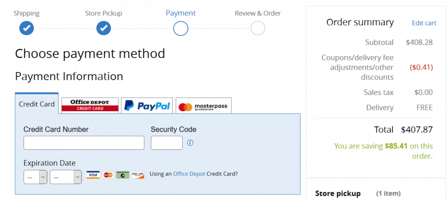
It should be the new rule to keep things short! You must get rid of lengthy checkout procedures that include needless paperwork. Have you ever had to go through the time-consuming checkouts where you wanted to give up before completing your purchase because you couldn’t figure out how to get to the end checkout process? Isn’t it annoying? Make it a game for your consumers and force them to circle in uncertainty; it’s not an enjoyable experience.
We’ve all done it. We go to a store, look at their products and make an impulse buy. Then we get home and discover that the item wasn’t exactly what we expected or was damaged when it arrived in its packaging. This is known as buyer’s remorse or buyer’s guilt, and it happens to the best of us! That being said, if you want your customers to have a great experience buying from you online—and purchase from you—you must take extra measures to prevent them from abandoning their carts throughout the purchasing process. Each additional step at the checkout phase will just increase your client’s likelihood of leaving their cart, resulting in your loss.
The best way to deal with this is to create a Guest Checkout instead of forcing the visitor to create a profile first.
5. Fast Load Time
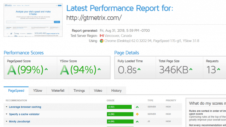
Research shows that the loading speed is directly proportionate to customer conversions. The faster a page loads the more customers will be engaged and do business on your site. It might be nice to have a trendy-looking website, but visitors won’t hang around more than 10 seconds for it to load anyway. Spectate your page speed and optimize your web performance and your customers will thank you, trust me! Make sure your website loads faster. You can use page speed tools to enhance the performance. This may lead to higher user engagement, retention, and conversions. Remember, customers will leave your website if it doesn’t load properly.
6. Navigation
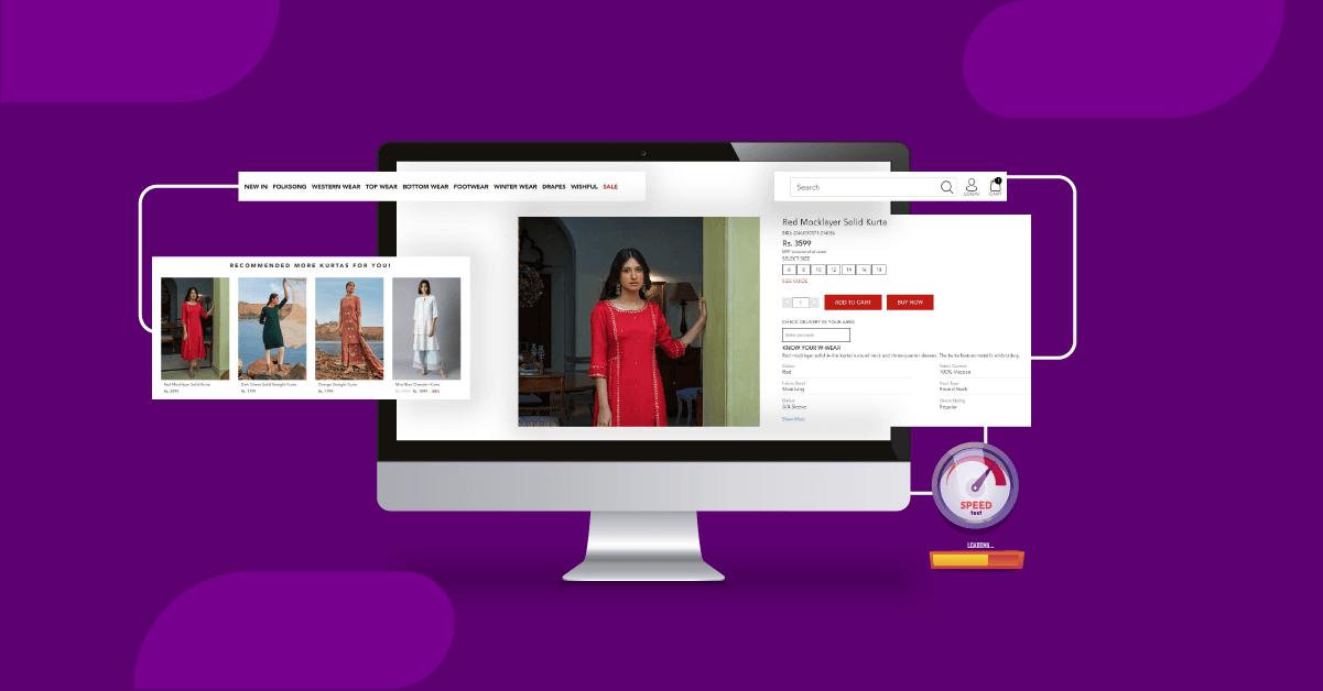
Users only lookout, for one thing, that is ease. Your website may not be all that fancy yet be customer delight, simply because of, its UI/UX. Users require simplicity and ease in terms of interface. When a visitor lands on your e-commerce website they’re probably looking for a specific product. They are usually in a hurry. Navigation through your site must be logical, robust, and intuitive. Lost visitors equal lost sales so make sure the customers do not wade through layers of pages of your website for nothing.
Website navigation is the key to the success of any e-commerce website. It should be clean, clear, and user-friendly. The two main aspects that help to develop a relationship between client and products by eliminating any sort of confusion are the UI (User Interface) and UX (User Experience). The reaction of users towards the site can be determined with the help of the user interface. UI deals with the technical features of a website. UX, on the other hand, deals with how the user feels while browsing your website so it’s basically about the whole look and feel of the website.
7. Simplified Menus
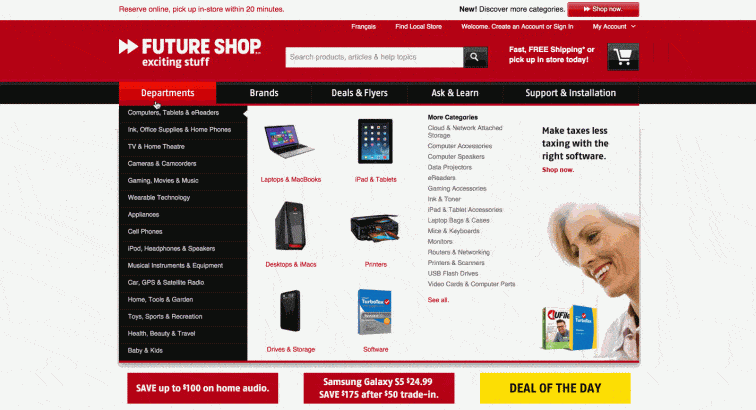
Menus are a great way to stay organized and group what you’re selling. But, you don’t want to overcomplicate things. Too many menu categories will confuse the consumer, preventing them from finding what they came looking for. Your menu shouldn’t be super-specific. Instead, use broad terms to categorize your products. Also, don’t forget to add a Search Bar to your website. It immensely helps your customers to track what they want. This will help you incorporate ceratin similar items into one menu rather than having different menus for each; that makes the website look clutter-free as well.
8. Share Feature
This is one of my most favorite features that many websites are now offering. It makes it so easy to ask for suggestions if and when unsure about the product of your choice. The sharing feature allows you to share the product outside of the website on other social platforms. Some kind of sharing button is a must for online marketing and to encourage the visitors of your site to share your content. In today’s digital age, shareable content plays a crucial role as it drives traffic to your website.
Conclusion
Running an e-commerce business is difficult, and making it a success is even more challenging. However, you may look to the above guidelines for pointers on where you may be falling short. These tasks can either be handled by yourself or engaged the services of experts or omnichannel marketing firms to complete them for you. Make certain that your website is up-to-date regularly.
One of the most essential things I’d want to mention here is that, whatever you do to improve the customer experience, make sure to also consider the security of the website and your consumers by going above and beyond with an SSL certificate.
Need expert solutions to take your e-commerce business to the next level? Start your free trial with Wigzo now!